WordPress Training Guide
This guide will cover the essentials of using WordPress and the unique custom features we’ve built for you. If you have questions, please reach out to us!
Table of Contents
Training Video
WordPress Basics
The WordPress Dashboard & Left Hand Menu
Toggling Between the Frontend & Backend of the Website
Media
Content
Options Pages & Page Templates
Custom Blocks
Custom Post Types
View the Full Training Video
Site Access
In the future you may need to grant permissions to others or adjust who can access different parts of your site. Here’s how you can manage user accounts and control site access:
Adding a New User
- Go to “Users” > “Add New.”
- Fill in the user information, including username, email, first name, last name, and password.
- Choose the appropriate role for the user (e.g., Administrator, Editor, Author, Contributor, Subscriber).
- Click “Add New User.”
Editing an Existing User
- Go to “Users” > “All Users.”
- Click on the username of the user you want to edit.
- Make the necessary changes, such as updating the email, changing the role, or resetting the password.
- Click “Update User.”
Deleting a User
- Go to “Users” > “All Users.”
- Hover over the username of the user you want to delete and click “Delete.”
- You will be prompted to reassign or delete the content created by this user. Choose the appropriate option and confirm the deletion.
User Roles and Permissions
Understanding user roles is crucial for managing site access effectively. Here are the default WordPress user roles and their capabilities:
Subscriber: Can manage their own profile and view content. Suitable for membership or subscription-based sites.
Administrator: Full access to all site features, including theme and plugin management, user management, and content creation/editing.
Editor: Can publish and manage posts, pages, and other content types created by any user.
Author: Can publish and manage their own posts.
Contributor: Can write and manage their own posts but cannot publish them. Posts must be approved by an Editor or Administrator.
Logging into WordPress
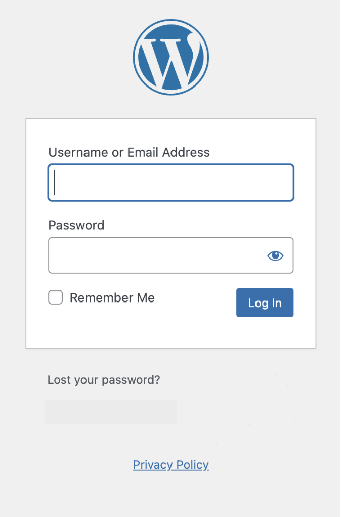
Go to https://www.vantage.ag/login
Enter your login credentials provided by the administrator.
Once logged in, you’ll be directed to the WordPress dashboard.
If you forget your password in the future, you can use the “Lost your password?” functionality below the login.
The WordPress Dashboard & Left Hand Menu
Once logged in, you will land on the Dashboard Screen. From here you can see many options in your menu along the left side. The main area that you will use to edit is:

Toggling between the Frontend & Backend of the Website
When you are in the backend, click on the house icon on the top left of your screen to toggle between the backend and frontend.
This helps in quickly locating and editing specific pages.
Media Overview
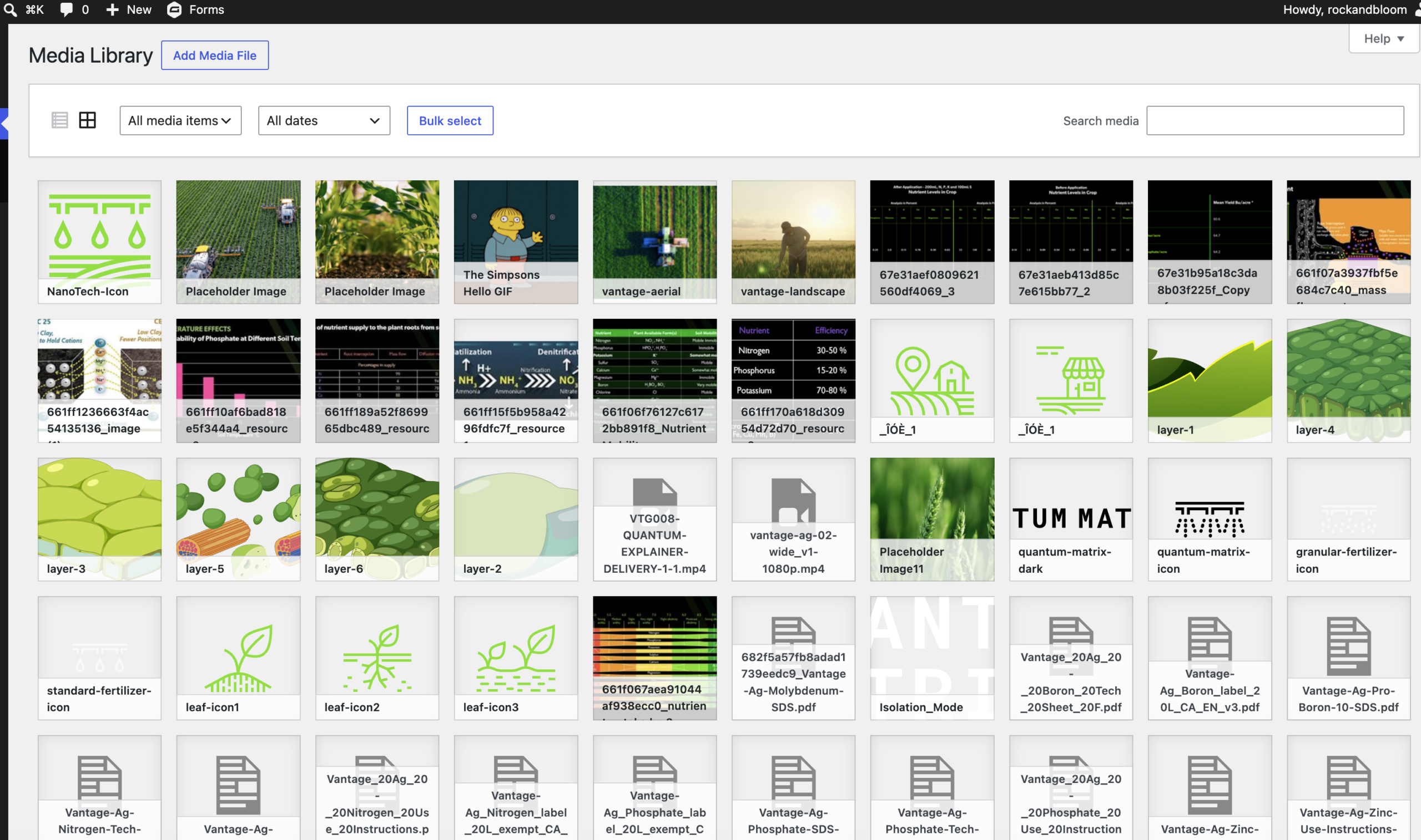
The Media Library contains all of the images, videos, logos and PDFs that are on your site. As there is quite a lot of media on your site, it has been divided into categories to make them more accessible.
Adding New Images & Videos
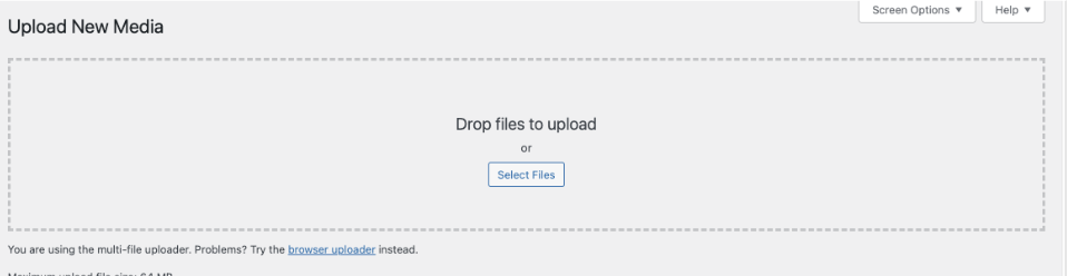
On the top of the Media Library, click on Add New. Then select the image or video that you want to upload.
The Upload option will open up and you can select or drag and drop images from your computer here.
Replacing Existing Images
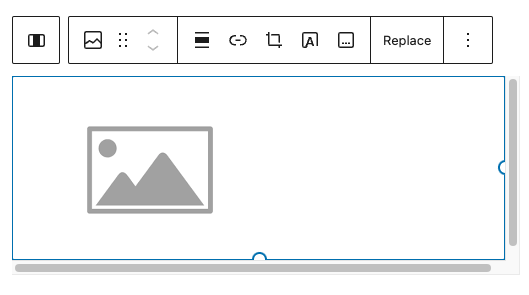
Hovering over the image will show the formatting options.
Clicking on the “x” will remove the image. The “Pencil” helps you to edit the existing image.
After removing the image, you can add a new one by clicking on “Add Image”
Add Image: Clicking here opens up the The Media Library.
The Media Library tab shows the images that are already on the website.
To add a new image you would click on the “Upload Files”
You can drag and drop or select files from your computer to upload.
Add Image: Clicking here opens up the The Media Library.
The Media Library tab shows the images that are already on the website.
To add a new image you would click on the “Upload Files”
You can drag and drop or select files from your computer to upload.
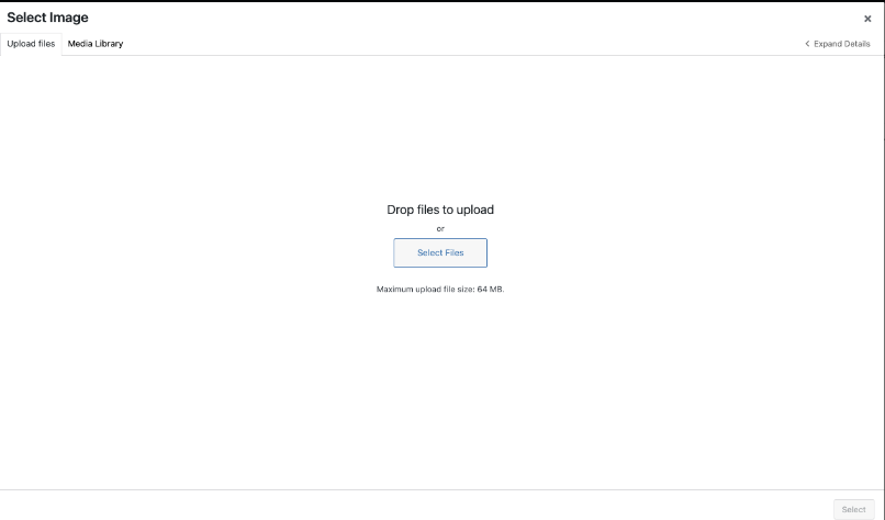
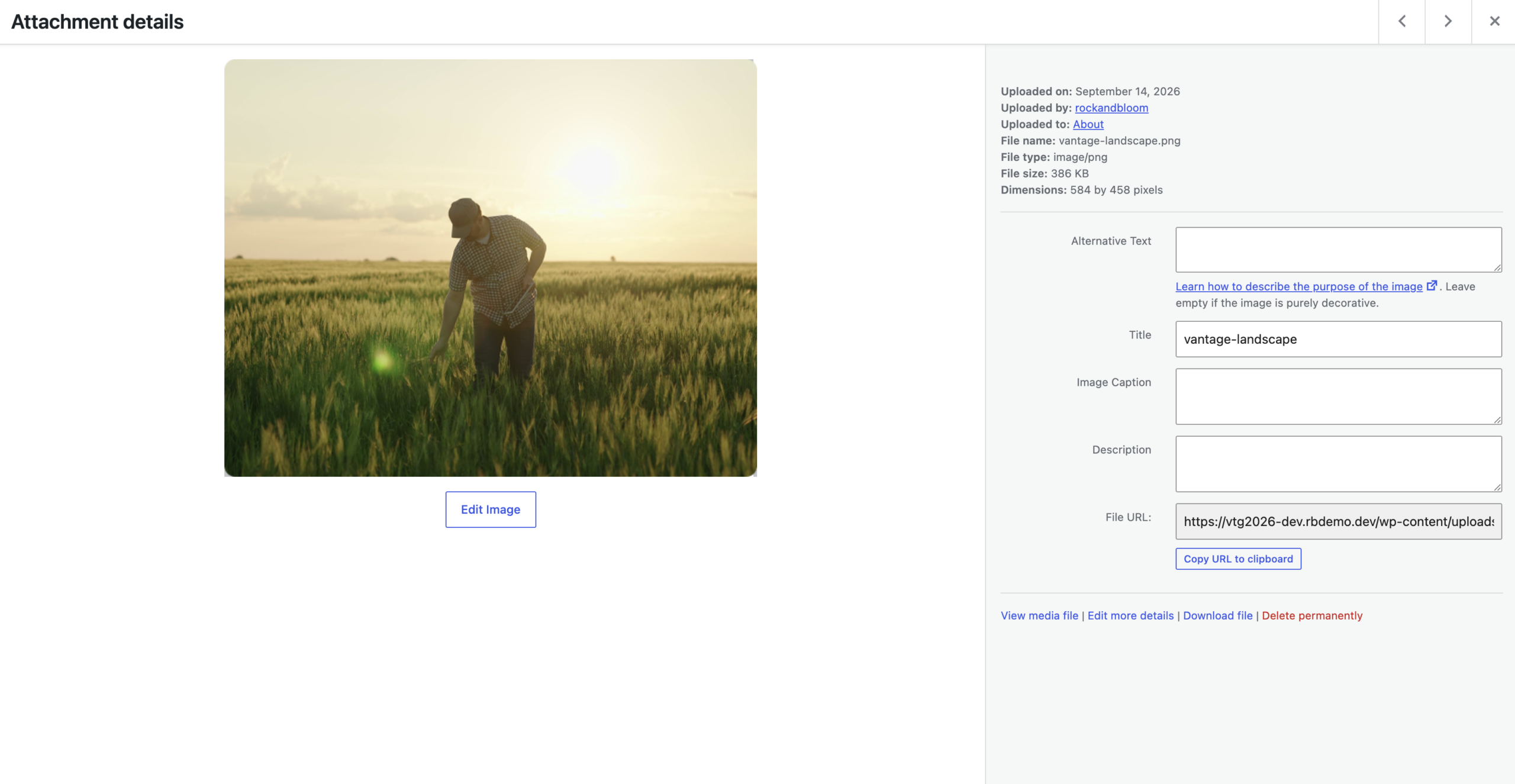
Image Sizes
Recommended Pixel Sizes
Feature image sizes (landscape 1200 x 900 pixels)
Feature image sizes (portrait 900 x 1200 pixels)
Background image size (1920 x 1080 pixels)
Logo image size (200 x 100 pixels)
Thumbnail image size (150 x 150 pixels)
Image Formats
JPEG or PNG
Image File Size
Optimize every JPEG and PNG before uploading to improve website performance. Compressing images enhances speed without sacrificing quality. Use squoosh.app for effective compression without resizing images.
Editing Content
Most of the content on this site is in the form of paragraphs. In some cases, certain words have web links added to them. These links can take you to pages within the site or an external site.
Saving all edits:
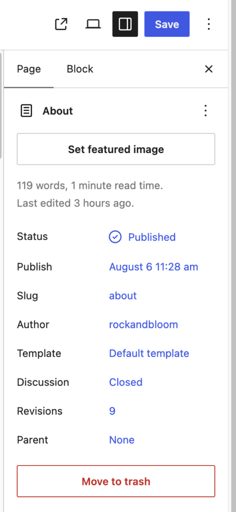
All page edits must be saved by clicking on the “Save/Update” Button on the top right of the screen
Formatting Text
To make your content more engaging and easier to read, you can format your text in various ways:
- Bold: Highlight text and click the “B” button.
- Italic: Highlight text and click the “I” button.
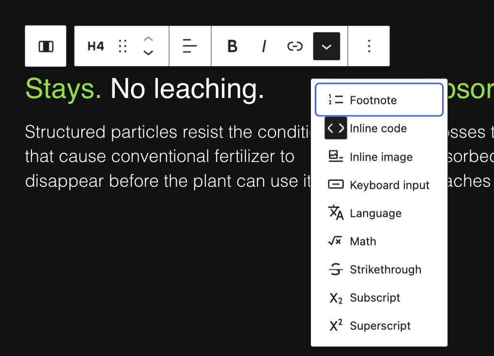
- Inline code: Highlight text in a sentence to be green. See visual example in Columns.
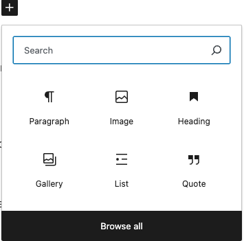
- Headings: Use headings to organize content. Select the text and choose the appropriate heading level from the drop-down menu in the editor.
- Lists: Create bullet points or numbered lists by clicking the respective buttons.
You can also add links to your content that would link to another page on your site (and internal link) or link to a different website (an “external link”)
To add a link to a certain word or phrase:
- highlight the word or phrase you would like to add a link to.
- Click on the “chain link” icon.
- Paste in or search for the link that you would like to add.
- Click on the link and press Enter.
- To add an external link, follow the same steps as above, except after adding the link, make sure the “Open in new tab” option is selected.

Schedule Post
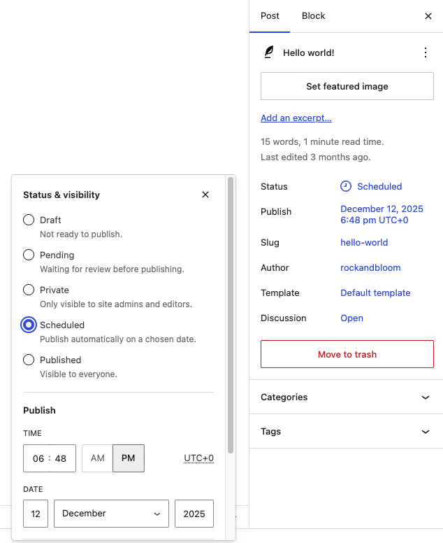
To schedule a post:
- Go to the Publish section on the right sidebar.
- Click the current publish value. The image, the value is Immediately.
- Set the date and time the post should be published on.
- Select the Schedule button that appeared on the top bar.

Company Details & Options
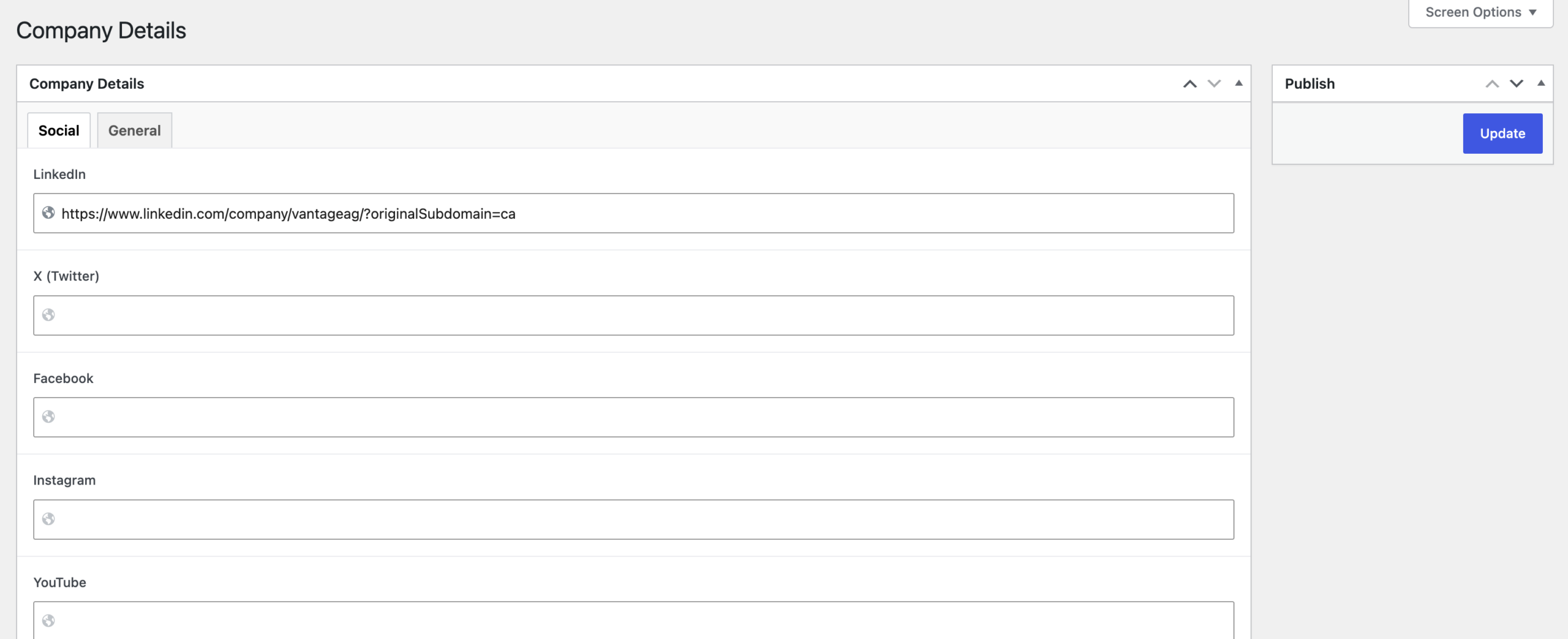
To edit key global content areas on the website (such as social links, contact info, location, copyright info), go to Company Details in the left sidebar.
To update global options (footer content, archive page content, 404 page content) go to Options.
Group
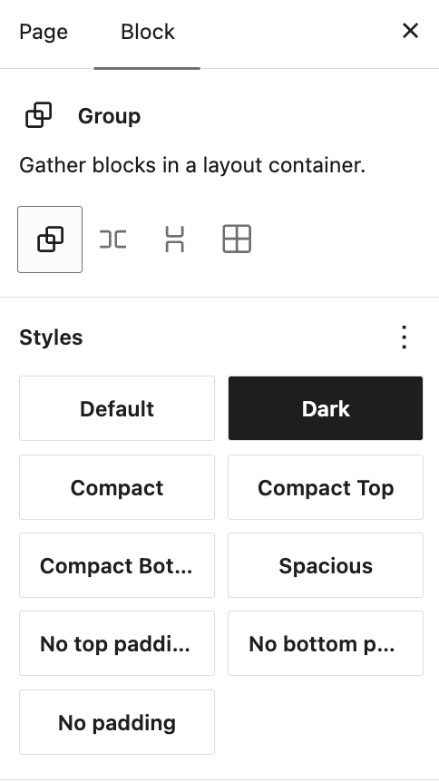
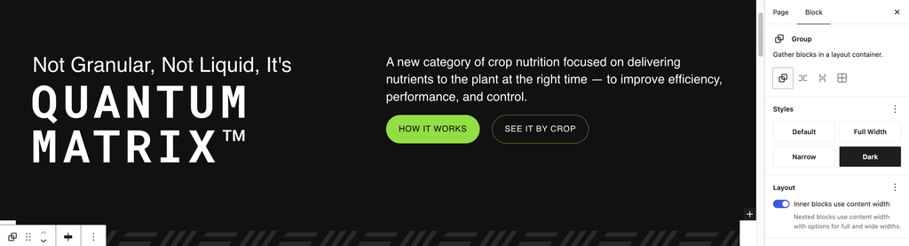
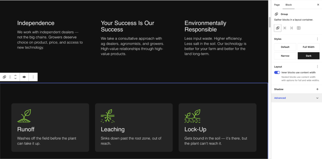
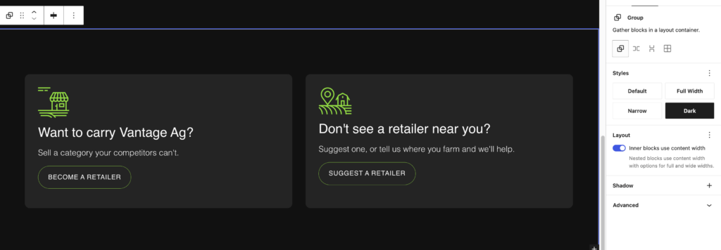
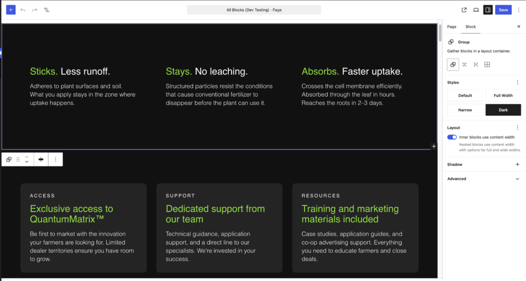
Use the Group block to build page sections. Each section uses two groups: one for the background and one for spacing. Choose a group’s style under Styles in the Block tab of the settings sidebar.
- Start with a Dark group. Every section starts with a Group set to Dark, unless it’s a custom ACF block that doesn’t need a group. Dark only adds the background colour. On pages using the Basic Page template, skip the Dark group and start with a Default group (or another spacing style) instead.
- Add a spacing group inside it. Add a second Group inside the Dark group and choose a spacing style. Your content goes inside this group.
Spacing styles
Choose a spacing style based on how close the section should sit to the blocks or groups above and below it. Compact padding is half the size of Default.
| Style Name | Space Above | Space Below |
|---|---|---|
| Default/Spacious | Large | Large |
| Compact | Compact | Compact |
| Compact Top | Compact | None |
| Compact Bottom | None | Compact |
| No Padding Top | None | Large |
| No Padding Bottom | Large | None |
| No Padding | None | None |
Width styles
To change the content width, nest a Full-width or Narrow group inside the spacing group. (Optional)
- Full-width: Narrow: Needs to be nested inside a Default or Coloured Group to be centred on the page with padding. Makes content width full-width.
- Narrow: Needs to be nested inside a Default or Coloured Group to be centred on the page with padding. Makes content width narrow; Does NOT centre content or add padding to the top/bottom.
Page Templates
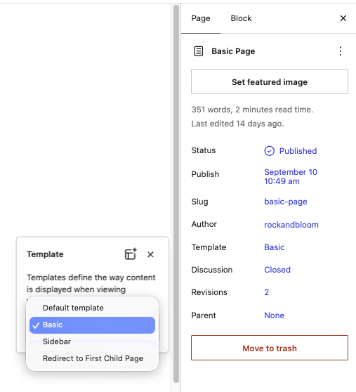
Most pages use the default template, built with Dark groups. For simple pages with a white background and no Dark groups, like the privacy policy and terms pages, use the Basic Page template.
To apply it, open the Page tab in the settings sidebar and change the Template to Basic Page. The page background switches to white, and the header automatically switches to dark text to match.
See these pages for examples: Basic Page, Privacy Policy, Terms of Service.
Columns
Use the Columns block to display content side by side. This is a core WordPress block with no custom styles applied.
You can place most blocks inside each column, including text, images, buttons.
A few things to keep in mind:
- You can adjust the number of columns and their width ratios from the block settings in the sidebar.
- On mobile, columns will automatically stack vertically.
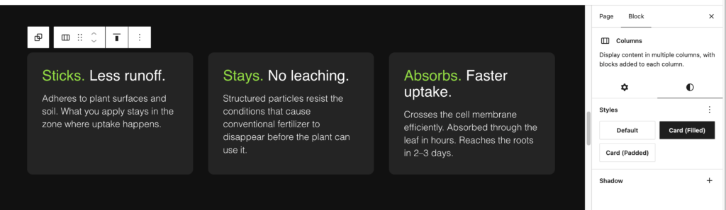
There are custom column styles to apply to columns. Select a column inside the Columns block and options will show int he right Style Panel.
- Card Filled – adds padding and background colour to each column
- Card Padded – adds consistent spacing around content in each column
Inline text colours applied through inline code. Shown in Formatting Text.
Buttons
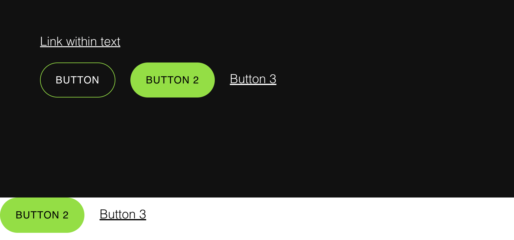
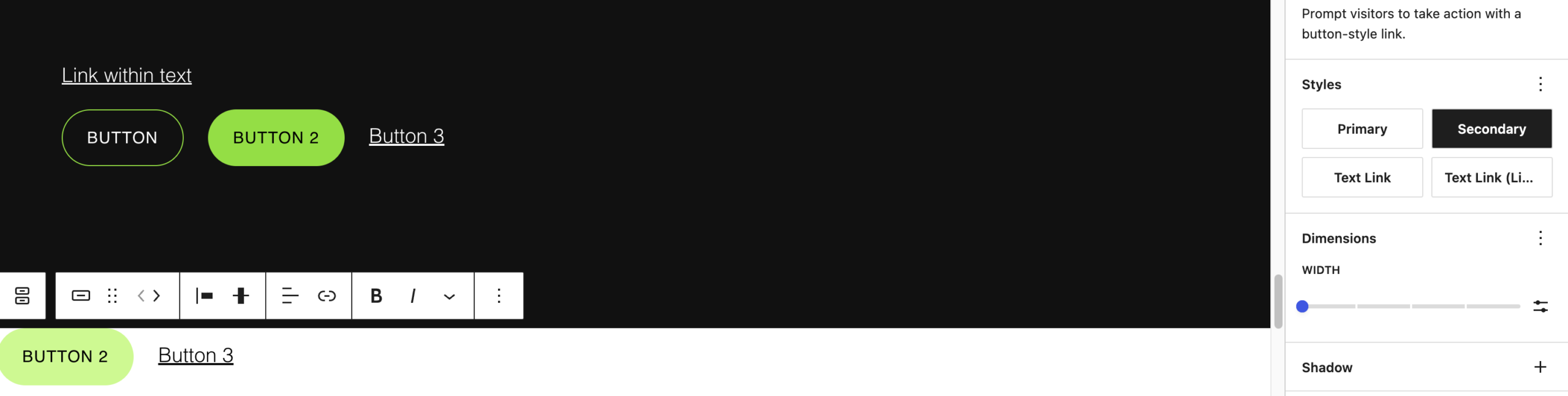
Add clickable buttons to your page using the Buttons block. We’ve set up three custom button styles to keep things consistent across the site.
The style options are:
- Primary: The main call-to-action button. Use this when you want something to stand out and grab attention.
- Secondary: A supporting button with less visual weight than the Primary. Use this when you have a second action alongside a Primary button, or when the action is important but not the main focus of the section.
- Text Link: A minimal button styled to look like a link with an arrow or indicator. Use this for softer actions where a full button would feel too heavy — things like “Read More” or “See Details.” Works well at the end of a content section as a subtle nudge.
- Text Link (Light): Same as text link just lighter variation for visibility on darker backgrounds.

Hero Banner
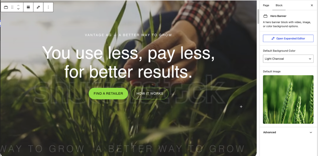
Block requires:
Video comes from theme code.
- Default Background Colour: Charcoal or Light Charcoal as backup if video fails.
- Image: Default Image as video backup
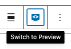
- Content: Edit in Preview Mode
- Select the block and select the preview mode option shown above the block
Do NOT include inside Group.
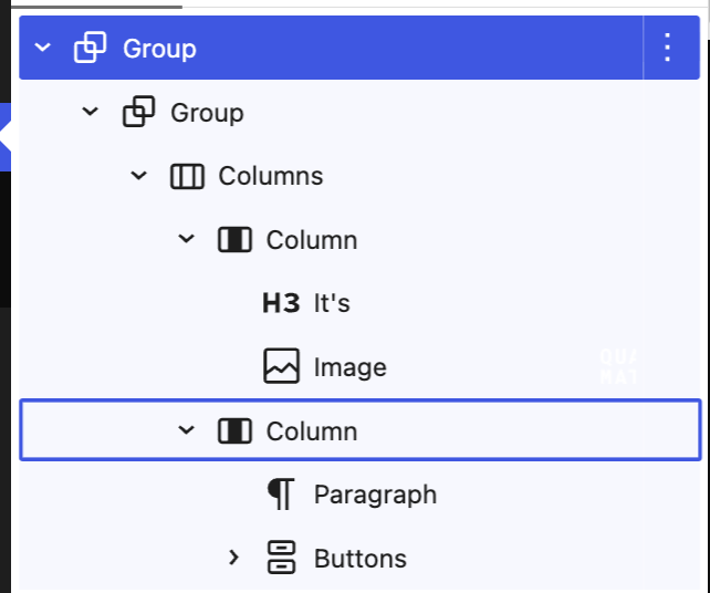
Subpage Banner
Block requires:
Group – Dark
> Group – Default or Spacious
> Columns – 2 columns (50/50)
> Your content (headings, paragraphs, buttons, etc.)
- Content: Edit in Preview Mode
- Select the block and select the preview mode option shown above the block
Bento
Block requires:
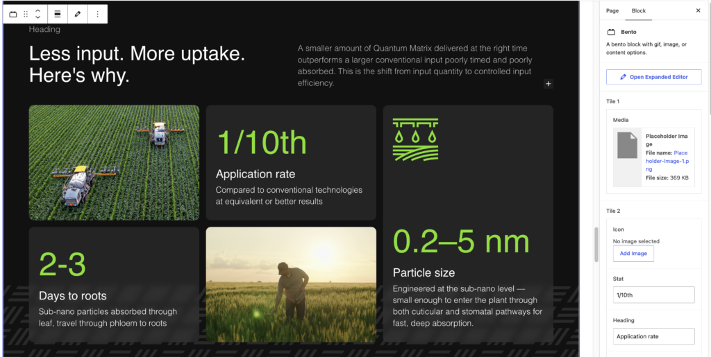
- Tiles 1 and 4 (media tiles)
- Media: photo, GIF or video
- Tiles 2, 3 and 5 (content tiles)
- Icon (optional)
- Stat
- Heading
- Description
Tiles 1–4 are small tiles arranged in a grid: Tile 1 top left, Tile 2 top middle, Tile 3 bottom left, Tile 4 bottom middle. Tile 5 is the large, tall tile on the right. All content fields are optional, so you can mix and match.
The Bento block also supports content above the tiles. Add blocks like headings, columns, paragraphs and buttons inside the Bento block, and they’ll display above the tiles. For example, the heading and paragraph above the tiles in the example are two columns added inside the block. Pattern in automatically applied.
Do NOT include inside Group.
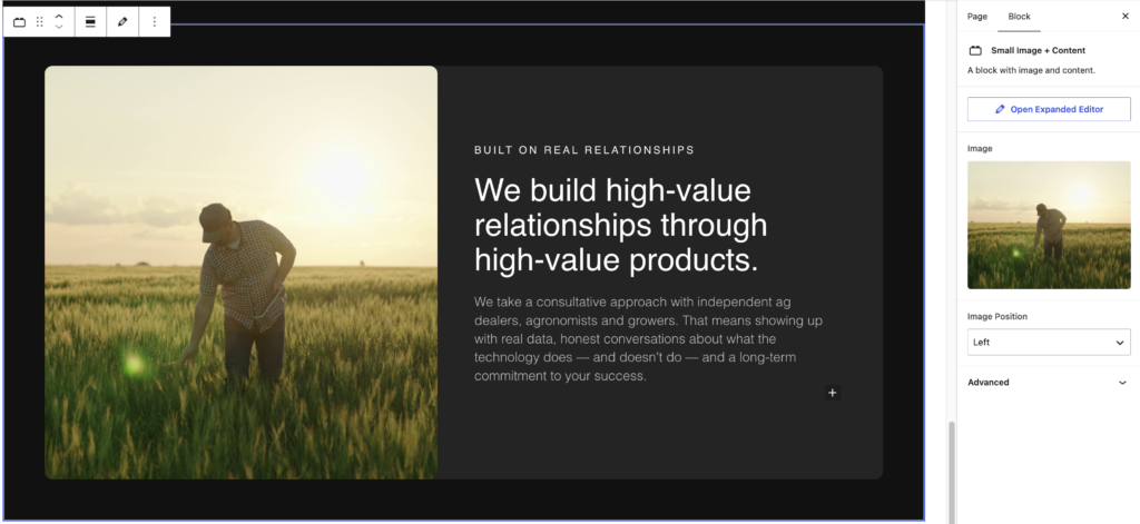
Small Image & Content
Block requires:
- Image
- Image Position: left or right
- Content: Edit in Preview Mode
- Select the block and select the preview mode option shown above the block
Do NOT include inside Group.
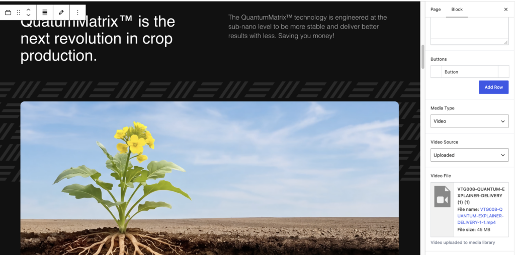
Full Image & Content
Block requires:
- Content Order: choose whether the content displays above or below the media
- Left Column: flexible content (WYSIWYG)
- Right Column: flexible content (WYSIWYG)
- Buttons (optional): up to 2 (shown in right column)
- Media Type: Image or Video
- Image: choose an image from the media library
- Video: choose Uploaded to use a video file from the media library, or External to link to a YouTube, Vimeo or other video URL
The pattern is applied automatically.
Do NOT include inside Group.
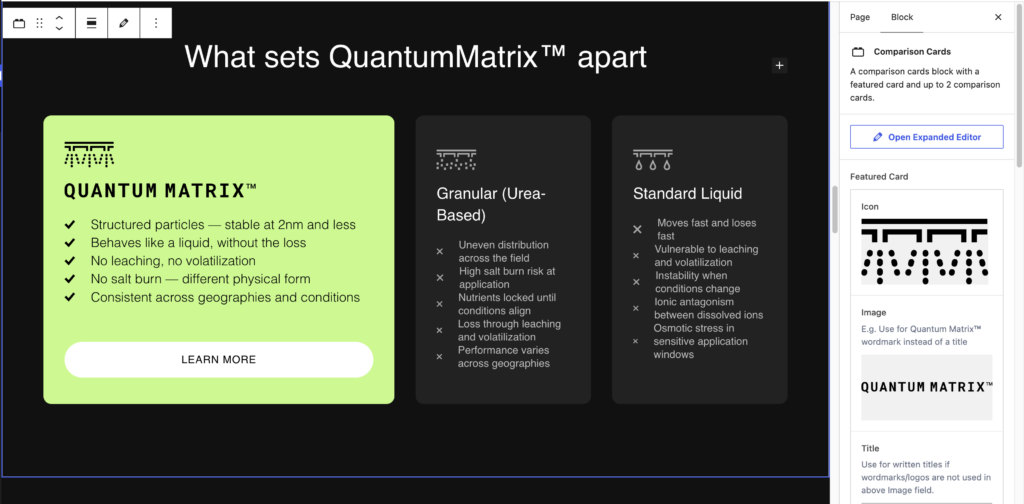
Comparison Cards
Block requires:
- Featured Card
- Icon
- Image (optional)
- Title
- Button
- List Items: add a row for each item
- Comparison Cards (up to 2)
- Icon
- Title
- List Items: add a row for each item
The Comparison Cards block also supports content above the cards. Add blocks like headings, paragraphs and buttons inside the block, and they’ll display above the cards.
- Content: Edit in Preview Mode
- Select the block and select the preview mode option shown above the block
Do NOT include inside Group.
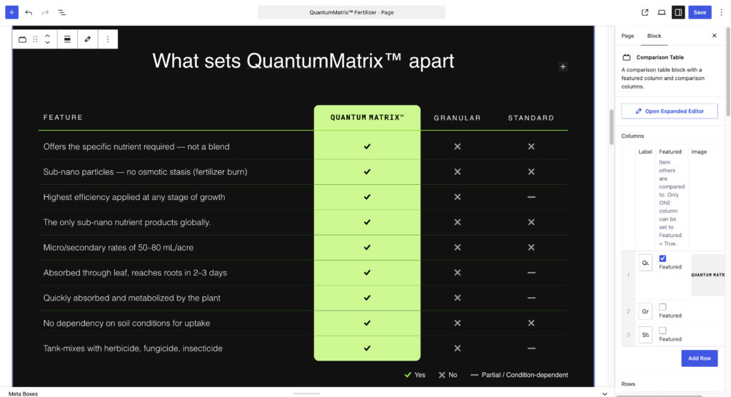
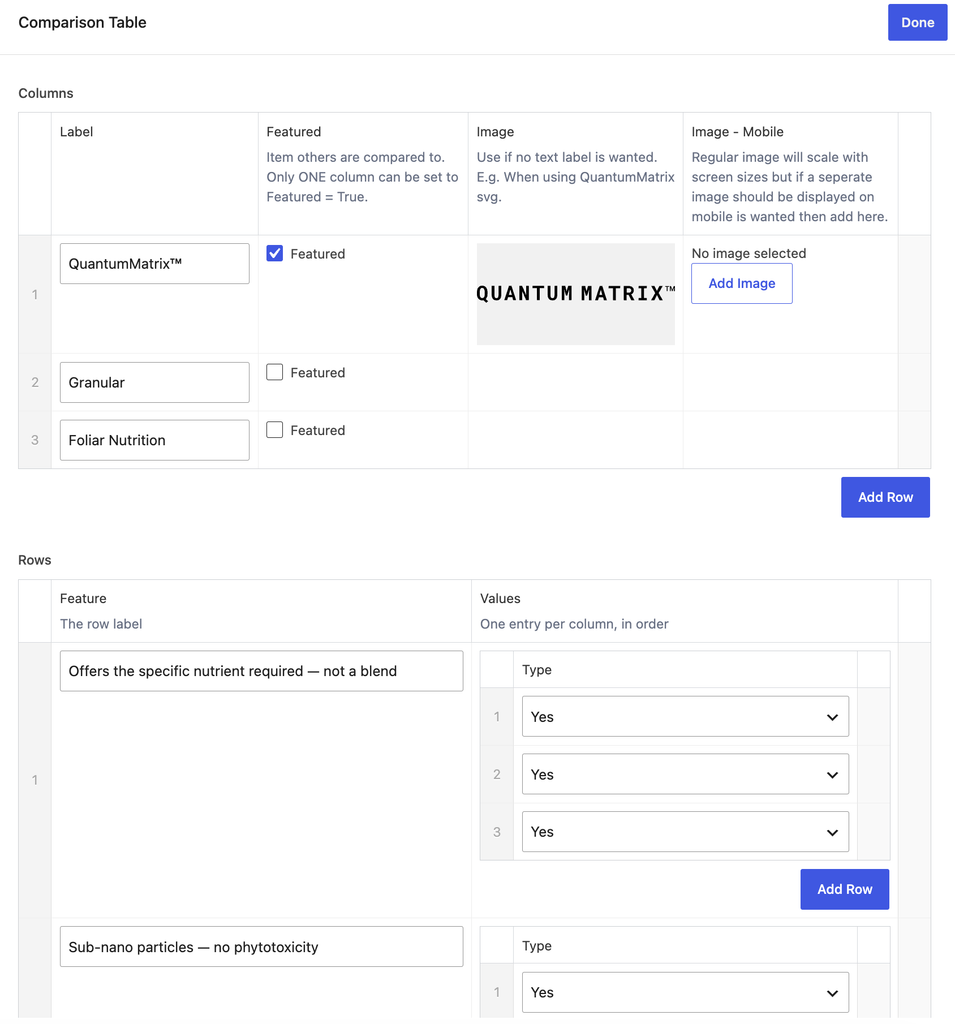
Comparison Table
Block requires:
Columns: add a row for each column
- Label
- Featured: tick to highlight the column. Only ONE column can be featured at a time.
- Image (optional): use in place of a text label
- Mobile Image (optional): the regular image scales with the screen size, so only add one here if a different image should show on mobile
Rows: add a row for each feature
- Feature: the row label
- Values: choose Yes, No or Partial for each column
- Content: Edit in Preview Mode
- Select the block and select the preview mode option shown above the block
Do NOT include inside Group.
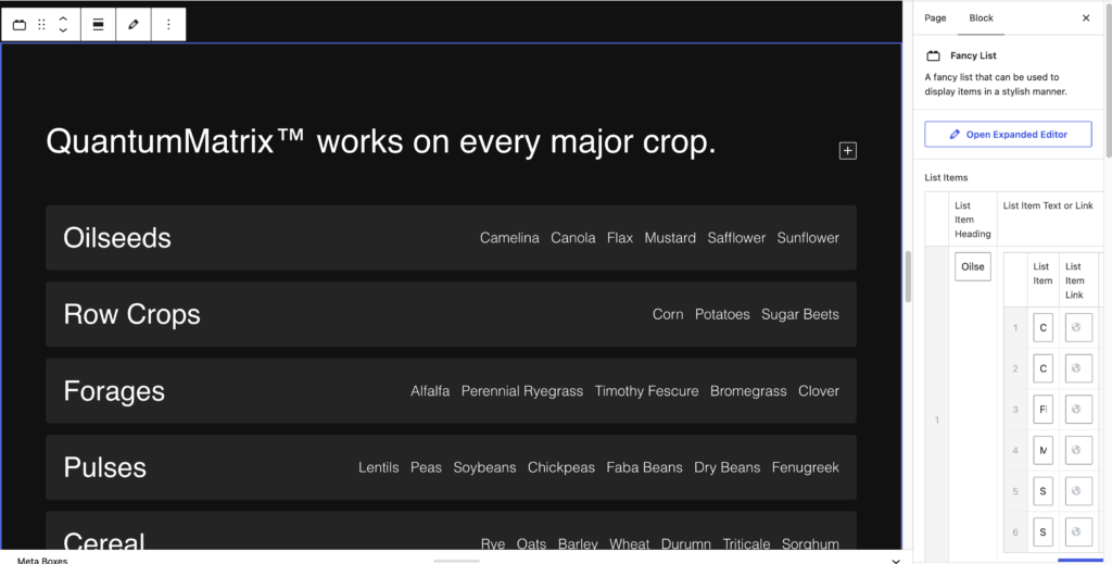
Fancy List
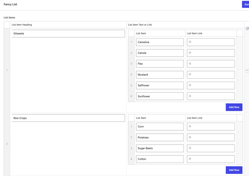
Block requires:
- List Items: add a row for each item
- Item Heading
- Item Text or Link
The Fancy List block also supports content above the cards. Add blocks like headings, paragraphs and buttons inside the block, and they’ll display above the list items.
Do NOT include inside Group.
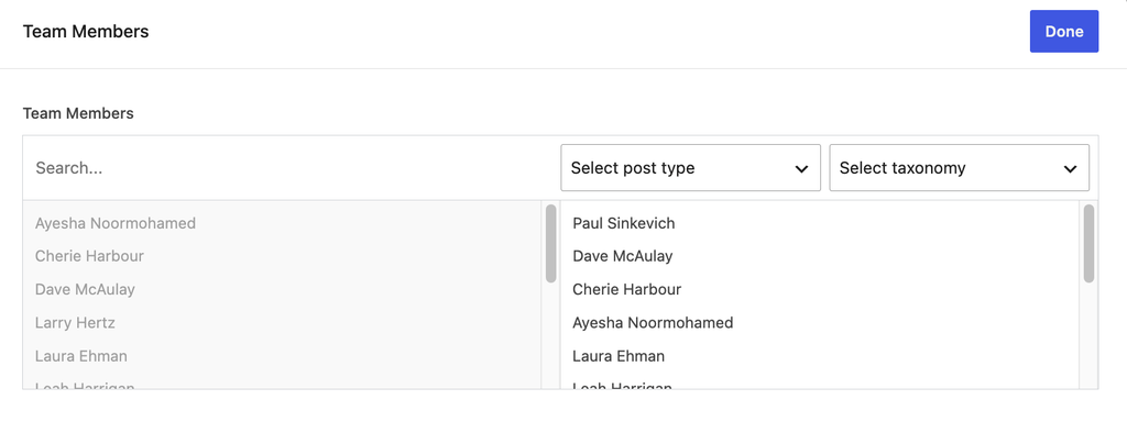
Team Grid
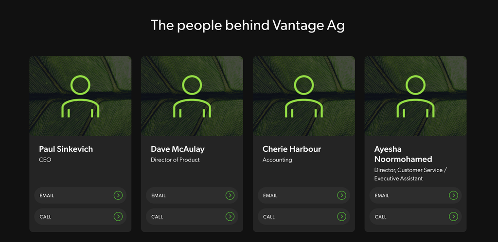
Block requires:
- Team Members: click a published team member from the Team CPT to add them to the grid. Drag to reorder.
The Team Grid block also supports content above the grid. Add blocks like headings and paragraphs inside the block, and they’ll display above the team members.
- Content: Edit in Preview Mode
- Select the block and select the preview mode option shown above the block
Do NOT include inside Group.
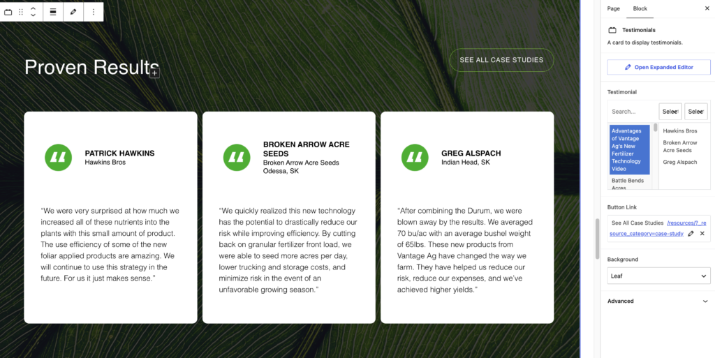
Testimonials
Shows up to 3 published Case Studies from the Resources CPT.
Block requires:
- Case Studies: click a case study to add it, up to 3. Drag to reorder.
- Button: View All
- Background: Leaf Image or Solid Colour (Dark)
The Testimonials block also supports a heading above the testimonials. Add a heading block inside the Testimonials block, and it will display above them.
Do NOT include inside Group.
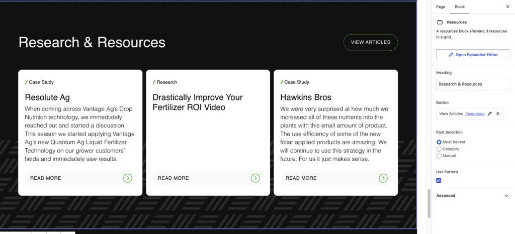
Resources
Shows up to 3 published Resources from the Resources CPT.
Block requires:
- Heading
- Button: View All
- Post Selection: choose how resources are selected
- Most Recent: shows the 3 most recently published resources
- By Category: shows the 3 most recent resources in the category you choose
- Manual: choose up to 3 resources from any category, and drag to reorder
- Pattern (optional): tick the checkbox to show the pattern
Do NOT include inside Group.
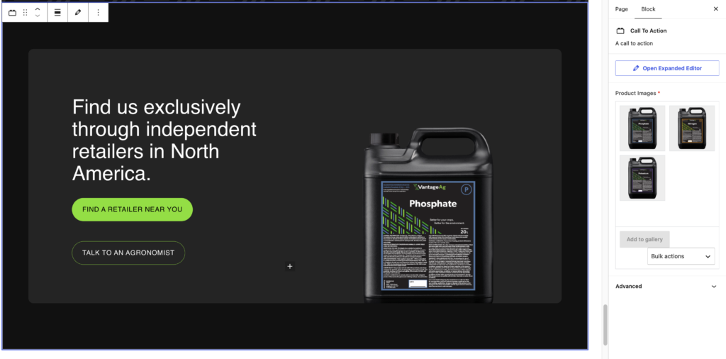
CTA (Call to Action)
Block requires:
- Gallery: add images of product labels. The images animate automatically.
The CTA block also supports content. Add blocks like headings, paragraphs and buttons inside the CTA block, and they’ll display with the gallery.
- Do NOT include inside Group.
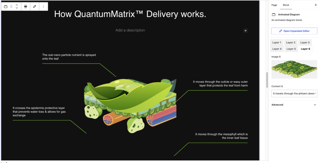
Animated Diagram
Block requires:
- Layer tabs (Layers 1–6), each with:
- Image
- Content: text for that layer
The Animated Diagram block also supports content above the diagram. Add blocks like headings, paragraphs and buttons inside the block, and they’ll display above the diagram.
Do NOT include inside Group.
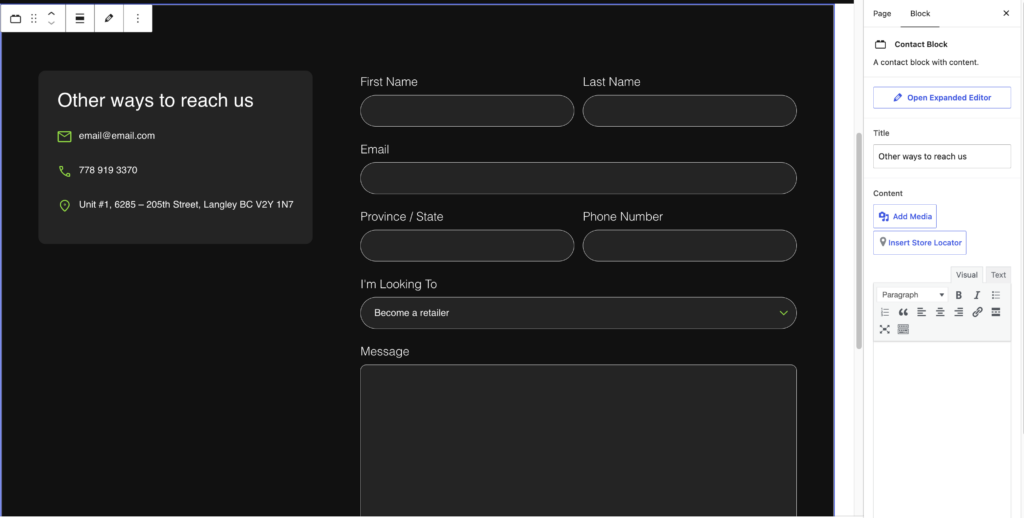
Contact Block & Form
Block requires:
- Title
- Content
- Contact Details (optional): displays the contact details from the Company Details options page. To change them, edit the Company Details page.
- Padding: Small or Large
- Form: choose a Gravity Form
To change the form itself, such as its fields or notifications, go to Forms in the dashboard. Changes made there update the form everywhere it’s used.
Do NOT include inside Group.
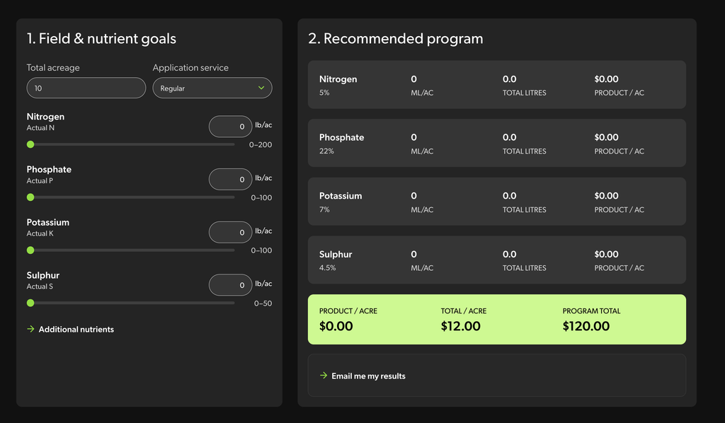
Nutrient Calculator
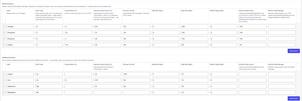
Calculator settings are under Nutrient Calculator in the dashboard. Enter every value exactly as it appears on the Vantage Ag spreadsheet; nothing needs to be calculated first. Changes update the calculator right away.
- Application Services: add a row for each service tier
- Label
- Price per Acre ($)
- Default Nutrients: the nutrient sliders that always show. Add a row for each nutrient.
- Label: e.g. Nitrogen
- Short Code: e.g. N. Shows under the slider label as “Actual N.” Each code must be unique.
- Concentration (%): shows on the result card
- Nutrient Content (lb per mL): copy from the spreadsheet’s Nutrient/mL column. Don’t invert this number.
- Price per Litre ($): copy from the spreadsheet
- Slider Min, Slider Max and Default Target (lb/ac)
- Minimum Rate (mL/ac) (optional): shows a notice on the result card when the calculated rate is below this, e.g. 100 for N, P and K, and 30 for S. Leave empty for no notice.
- Minimum Rate Message (optional): leave empty to use the default message
- Additional Nutrients: sliders that show when a visitor clicks “Additional nutrients.” Same fields as Default Nutrients.
- Email Results Gravity Form ID: the Gravity Form that receives the visitor’s details and results when they choose “Email me my results.” If this is empty, the Send button is disabled.
CPT: Products
Products are used for news items on the site. To create a new product, select Add New Product.
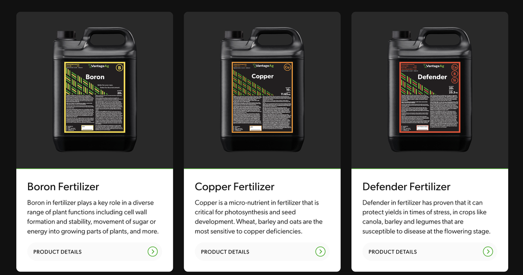
This Sample Product can be duplicated as a starting point or view as a reference point when creating new products.
Page content: add headings, paragraphs, buttons and other blocks in the editor. This content is the product description that displays beside the Physical Characteristics table.
Featured Image: set it in the Featured Image panel in the top right of the editor, under the Save button. This is the main product photo, used on the product listing page and in the single product page banner.
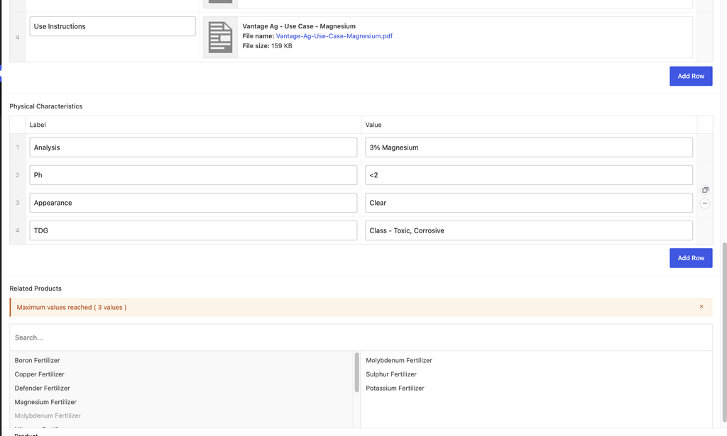
Product fields:
- Product Description: shows on the product card on the listing page and in the single product page banner. This is separate from the page content.
- Downloads: add a row for each download
- Link Label
- Link File
- Physical Characteristics: add a row for each characteristic
- Label
- Value
- Related Products: search and click a product to add it, up to 3. Drag to reorder.
Global Option Fields
These option fields are found under Options in the dashboard and apply across all product pages.
- Archive page (product listing page)
- Left Content
- Right Column Content
- Single product pages
- CTA Heading
- CTA Content
- CTA Buttons
- CTA Product Label Images
The CTA is the same on every single product page, so editing it here updates all product pages at once.
CPT: Resources
Products are used for news items on the site. To create a new product, select Add New Resource.
This Sample Resource can be duplicated as a starting point or view as a reference point when creating new products.
Adding resources
Page content: use standard blocks like headings, paragraphs, images and columns. Do NOT use custom blocks in resource content.
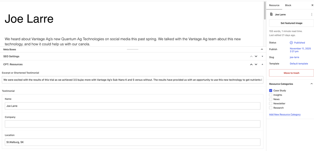
Categories: choose from the checkboxes in the right panel.
Featured Image (optional): set it in the right panel. If no featured image is set, a placeholder image shows instead.
Resource fields:
- Excerpt: an excerpt or shortened testimonial that shows on the listing page and in blocks that display resources
- Testimonial details (case studies only)
- Name
- Company
- Location
Global Option Fields
These option fields are found under Options in the dashboard and control the main Resources page.
- Left Content
- Right Content
- Buttons
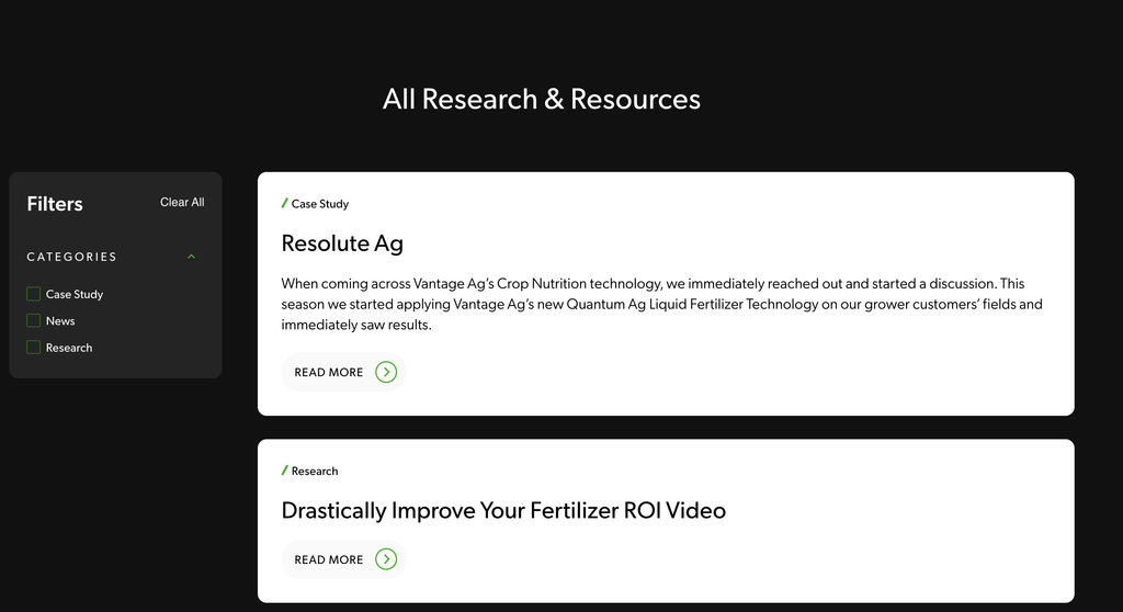
- Featured Post: choose a published resource to feature above the resources list
All published resources appear in the list automatically, from newest to oldest, and visitors can filter them by category.
CPT: Team Members
To create a new post, select Add New Team Member.
Team member fields:
- Name
- Title
- Photo
- Phone Number
Published team members can be displayed in the Team Grid block.
CPT: Store Locator (Retailers)
To create a new post, select Add New Retailer.
Retailers are managed under Store Locator in the dashboard. The Retailers page displays them using a shortcode block, so don’t remove or edit that block.
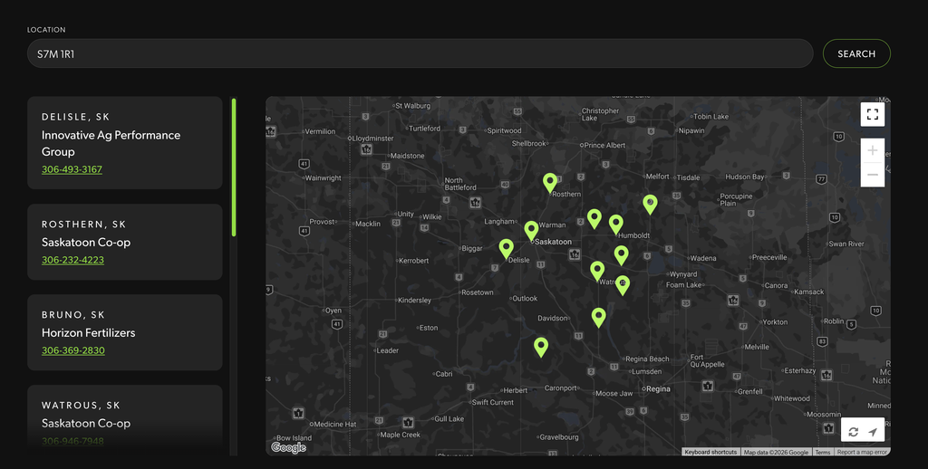
How visitors find a retailer: if a visitor allows their browser to share their location, the map automatically uses it. If not, they can type a location into the search bar instead. Either way, the 10 closest retailers are shown.
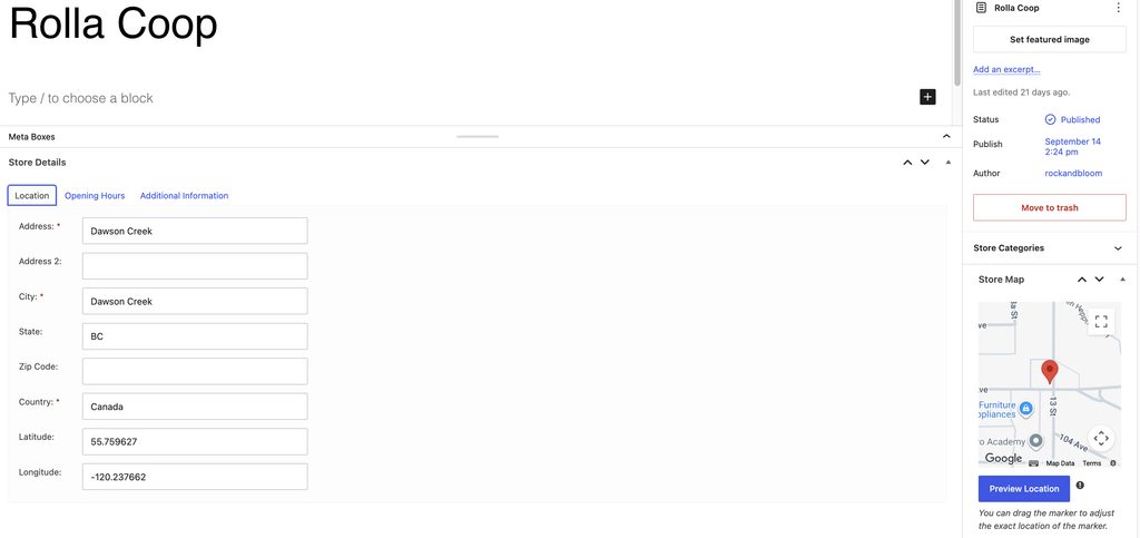
Retailer fields:
- Title: the retailer’s name
- Address
- City
- State: use the state or province abbreviation, e.g. SK or MI
- Country
- Latitude and Longitude: click Preview Location in the bottom right panel to fill these in automatically from the address. The retailer won’t appear on the map without them.
- Additional Info tab: Phone Number
Store Locator plugin
The map and search on the Retailers page are powered by the WP Store Locator plugin. Its settings, under Store Locator → Settings, control how the map and search work across the site and rarely need changing. For details, see the WP Store Locator documentation.
Contact Us
Questions? We’re here to help! Reach out anytime if you need a hand.

Molly Lux
Account Manager/Director
molly@rockandbloom.com

Meg Wilken
Creative Operations
meg@rockandbloom.com